

Introduction
In the end of 2023, before moving to Montréal, I decided to start playing a new game called ”Hi-Fi Rush”, because I’ve always been a fan of rhythm games (guitar hero best game ever made!) it’s not a surprise that I immediately loved the game and it’s now one of my favorites.
In the end of 2023, before moving to Montréal, I decided to start playing a new game called ”Hi-Fi Rush”, because I’ve always been a fan of rhythm games (guitar hero best game ever made!) it’s not a surprise that I immediately loved the game and it’s now one of my favorites.
So inspired by Hi-Fi Rush I've designed a vibrant action game UI/UX concept, my intention was to create something that features an energetic color palette, strong personality, and dynamic movements.
So inspired by Hi-Fi Rush I've designed a vibrant action game UI/UX concept, my intention was to create something that features an energetic color palette, strong personality, and dynamic movements.
Special thanks to @RetroStyle Games for the character assets
Special thanks to @RetroStyle Games for the character assets
Details
created by
Náthaly Moyano
Náthaly Moyano
Year
2023
2023
tools
Figma, Photoshop, Illustrator, After Effects, UE5 UMG
Figma, Photoshop, Illustrator, After Effects, UE5 UMG
Final Design
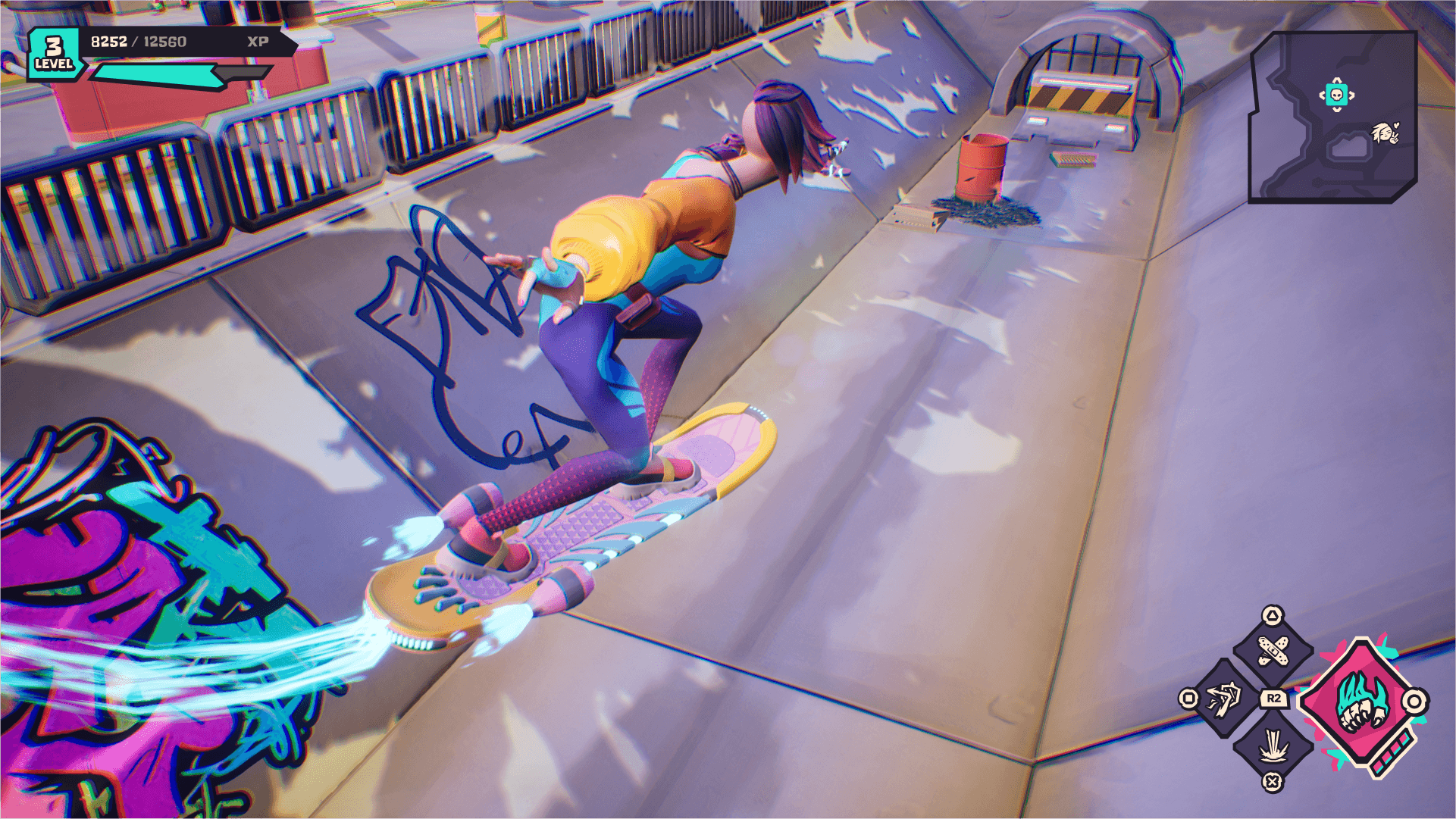
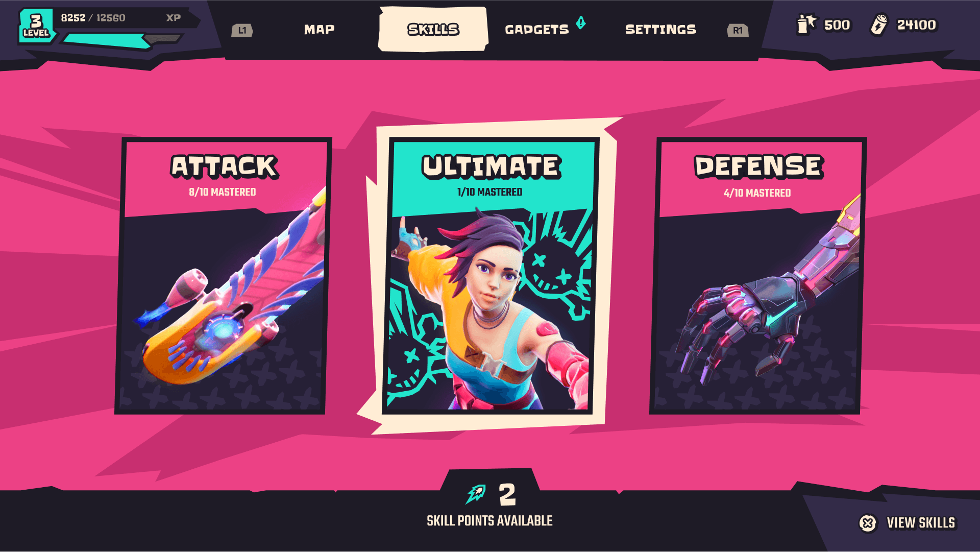
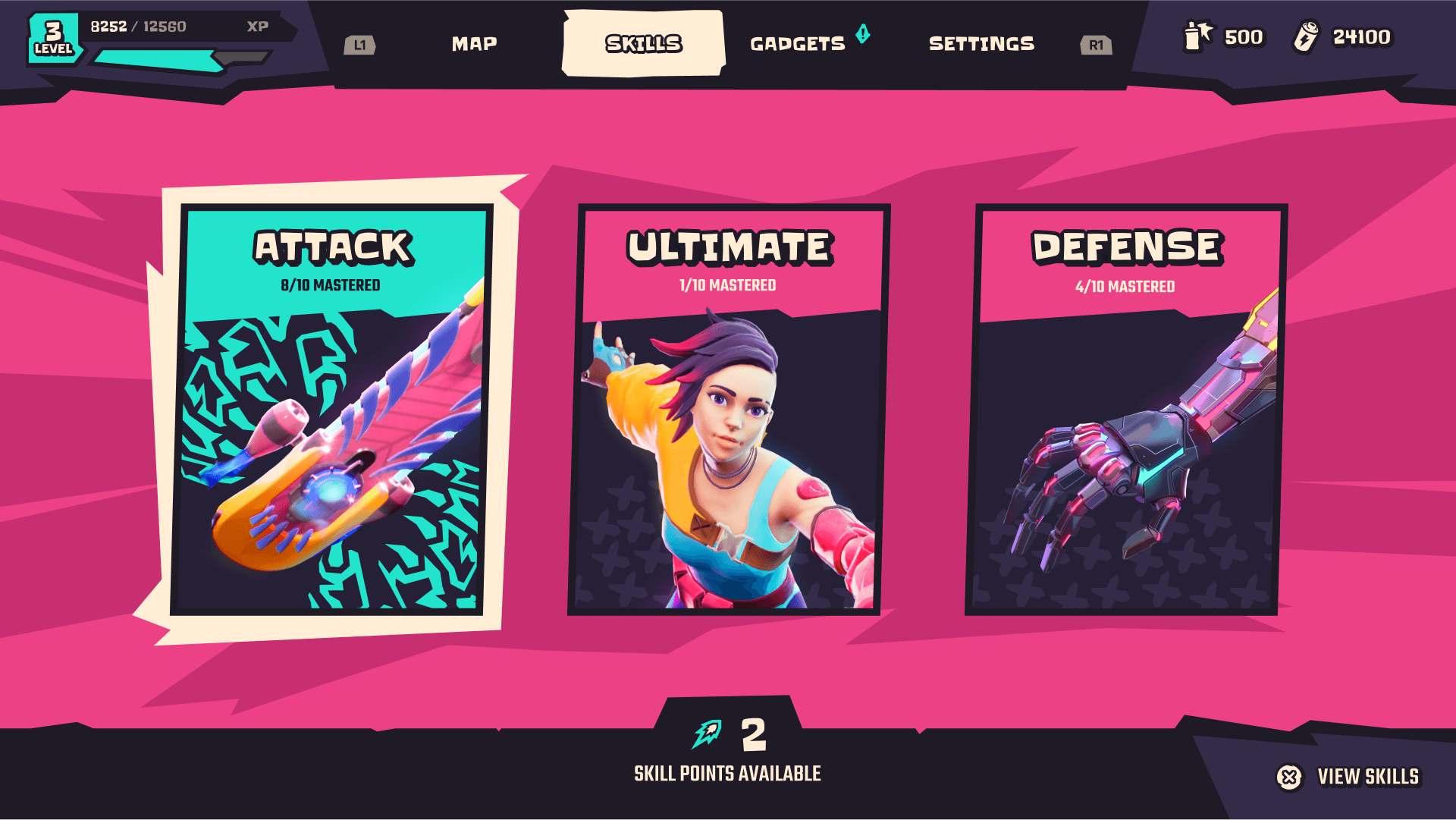
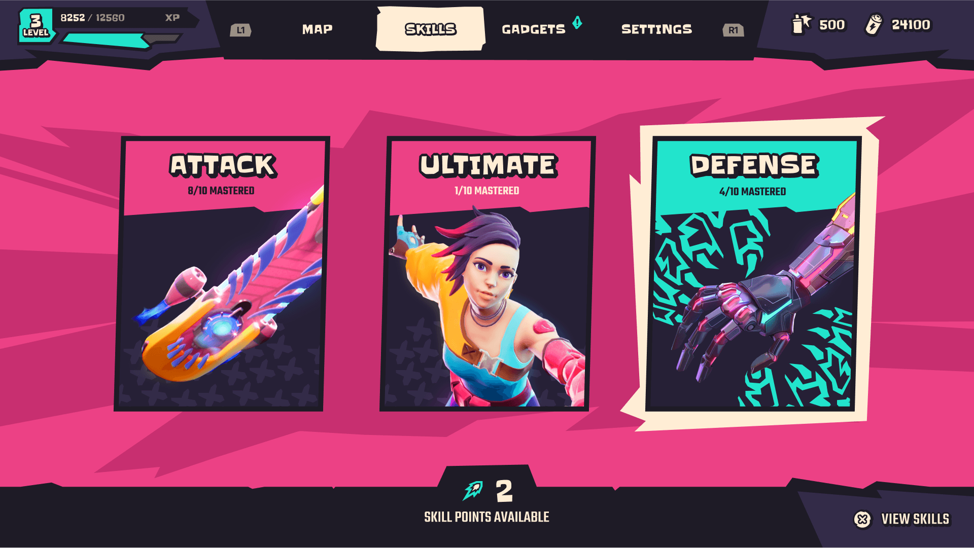
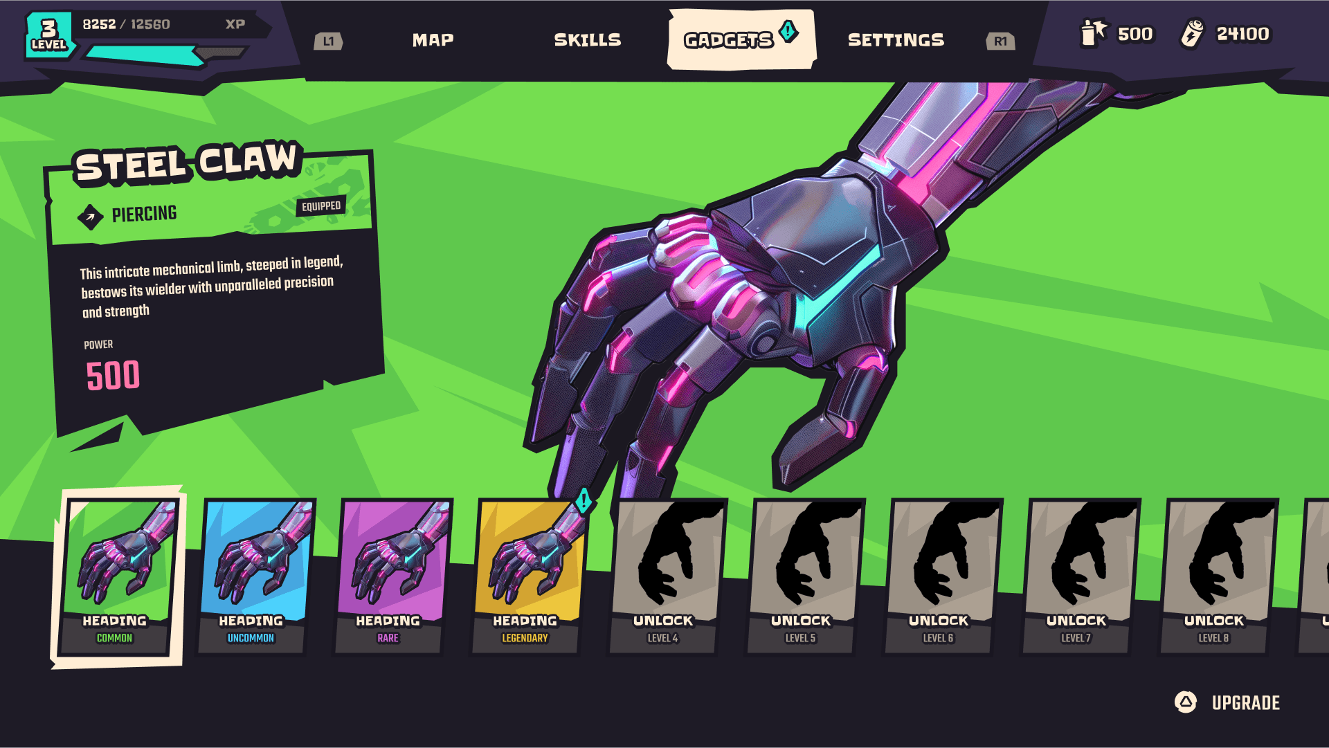
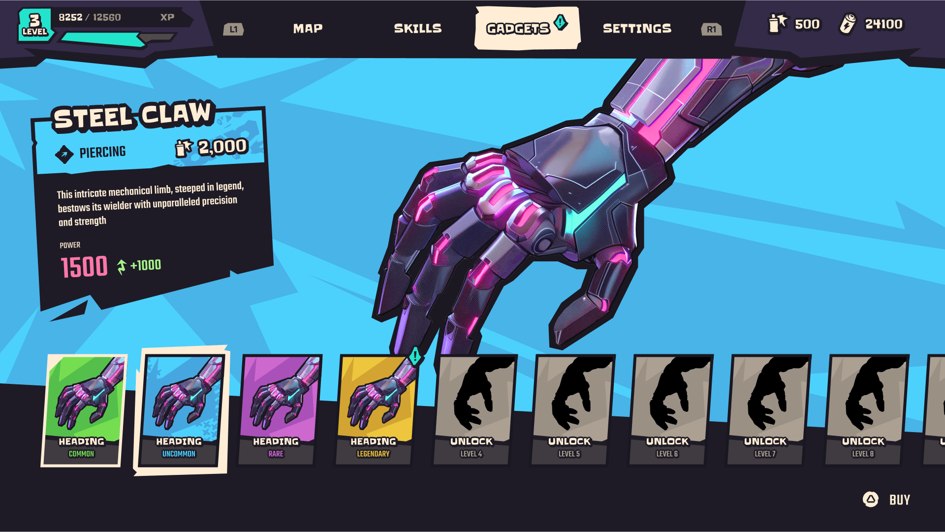
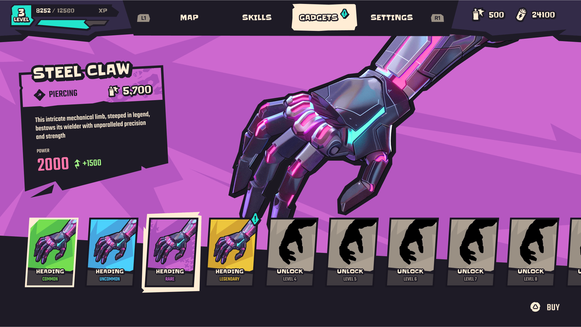
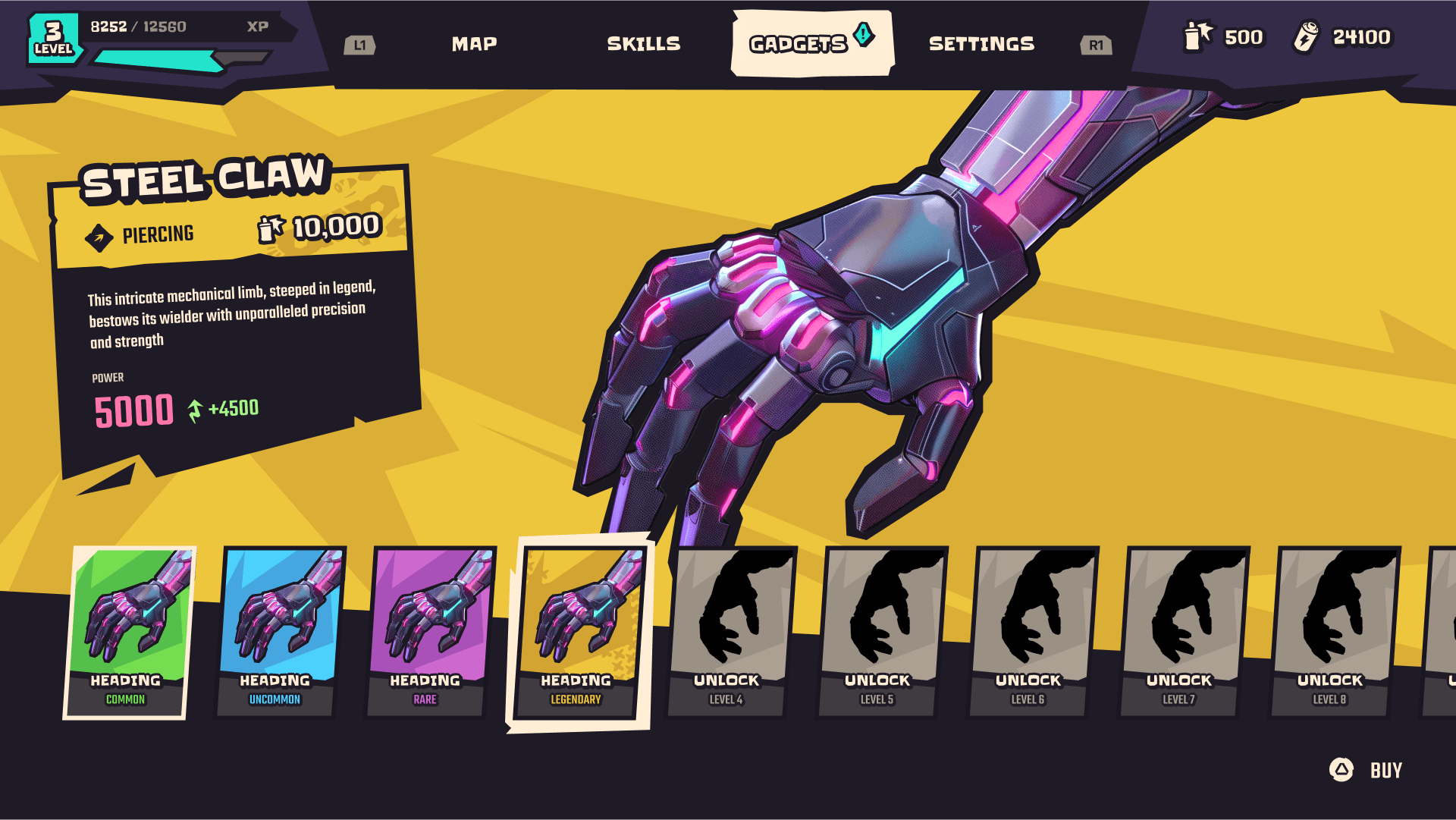
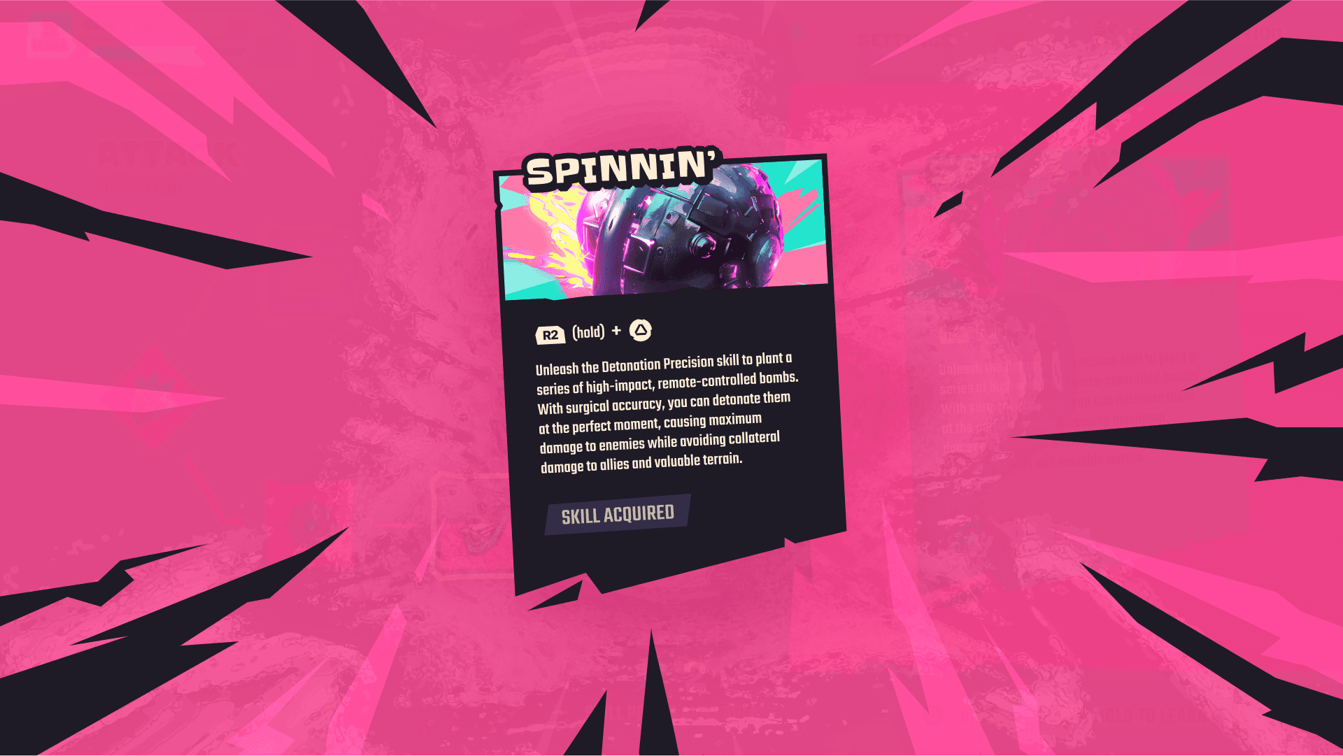
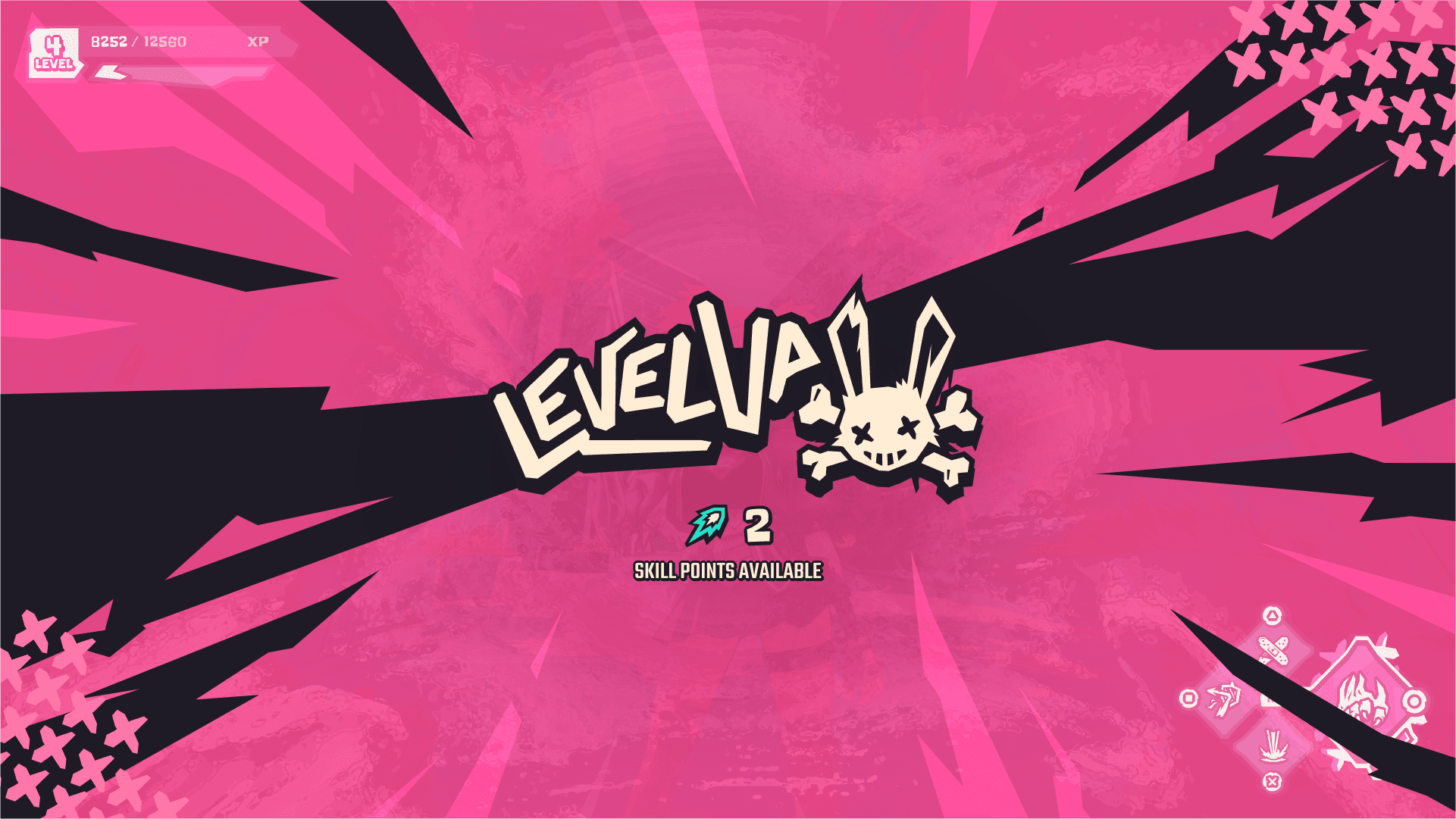
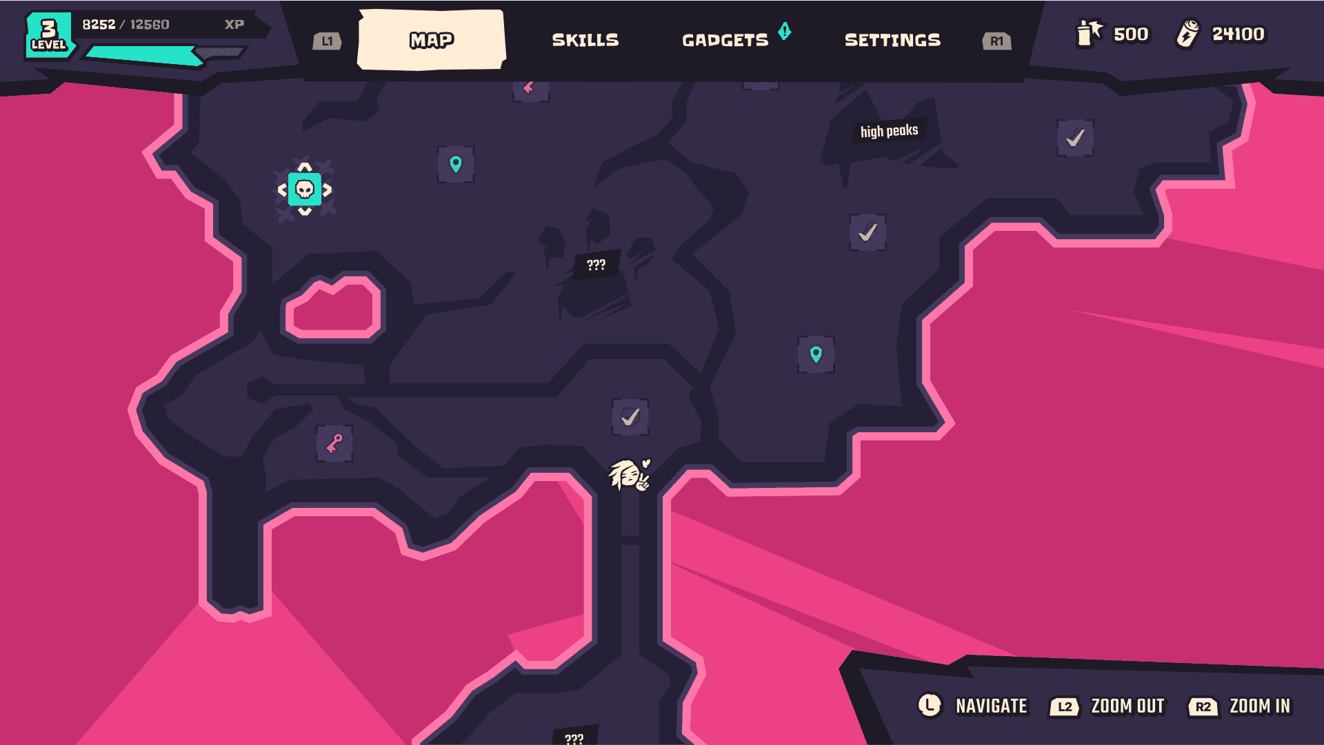
Starting by the final part of the project: screens. This way you can see what I’m talking about. I designed flows for the HUD, menu, skills, inventory, and map.
Starting by the final part of the project: screens. This way you can see what I’m talking about. I designed flows for the HUD, menu, skills, inventory, and map.
Overview
During my process, I defined the art direction for the UI, created consistent components organized in a UI kit, and developed some motion sketches.
During my process, I defined the art direction for the UI, created consistent components organized in a UI kit, and developed some motion sketches.
Menu + HUD
Click to view variants
Menu + HUD
Click to view variants


Menu + HUD
Click to view variants


Menu + HUD
Click to view variants


update
UI Integration
UI Integration
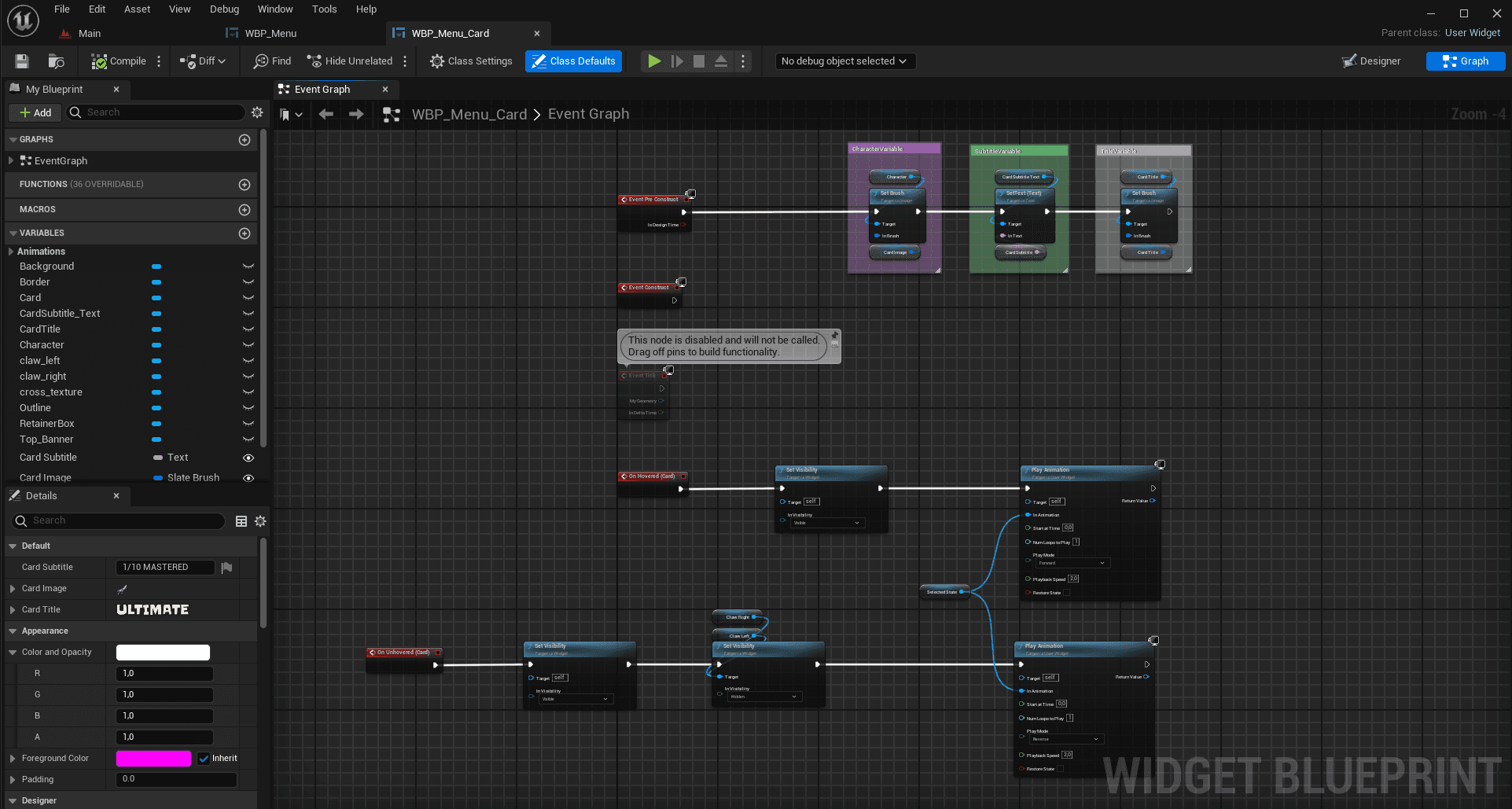
Work in progress: At the moment I'm working on integrating some parts of the UI in UMG, for now I have the menu card.
Work in progress: At the moment I'm working on integrating some parts of the UI on UMG, for now I have the menu card.
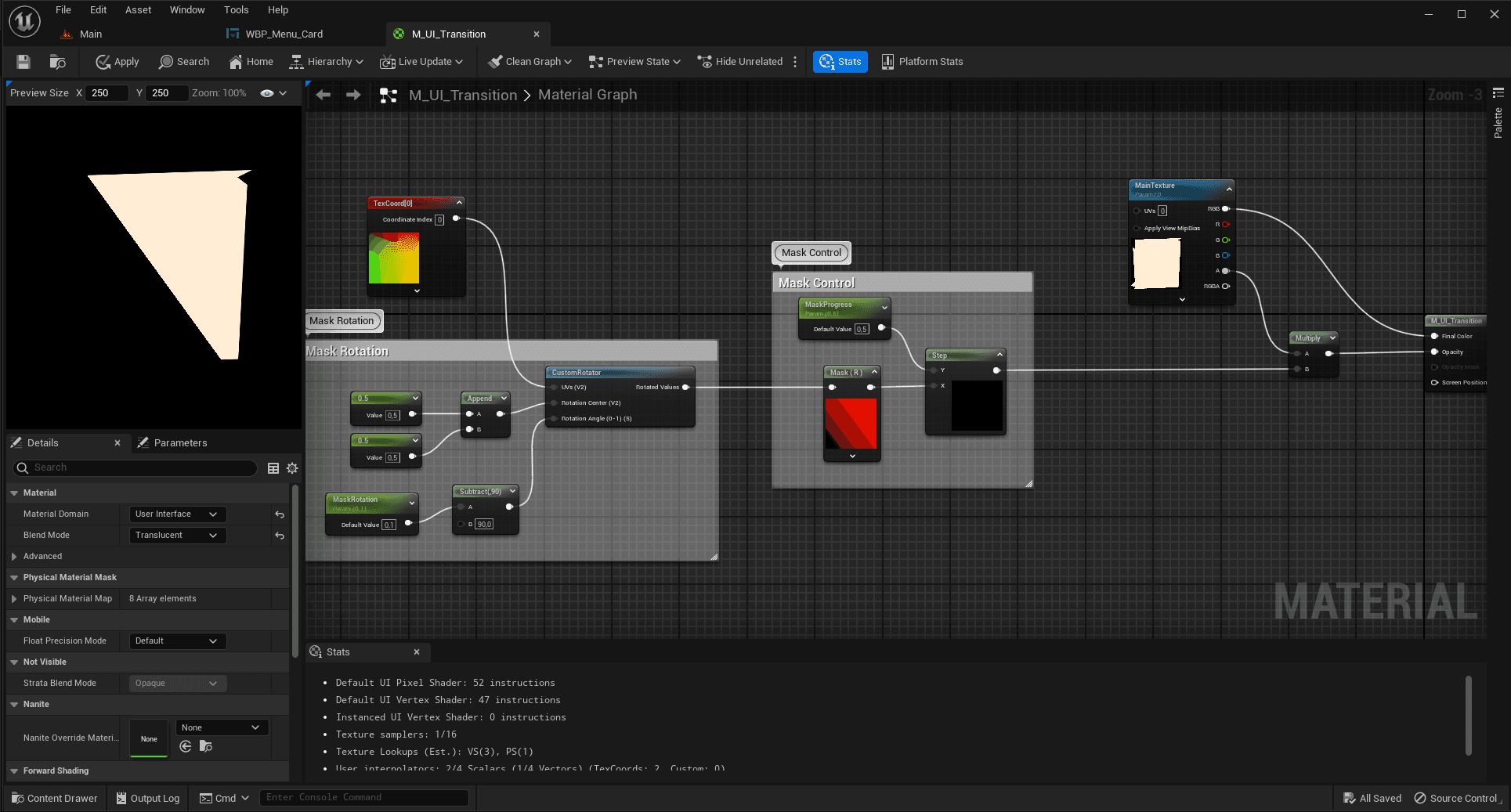
For the card I created 2 shaders: one for the banner mask transition, and another for the retainer box to hold the background textures. It also includes all the timeline animations, blueprint logic for hover effect and variables.
For the card I created 2 shaders: one for the banner mask transition, and another for the retainer box to hold the background textures. It also includes all the timeline animations, blueprint logic for hover effect and variables.




gadgets screen
Click to view variants
gadgets screen
Click to view variants


gadgets screen
Click to view variants


gadgets screen
Click to view variants


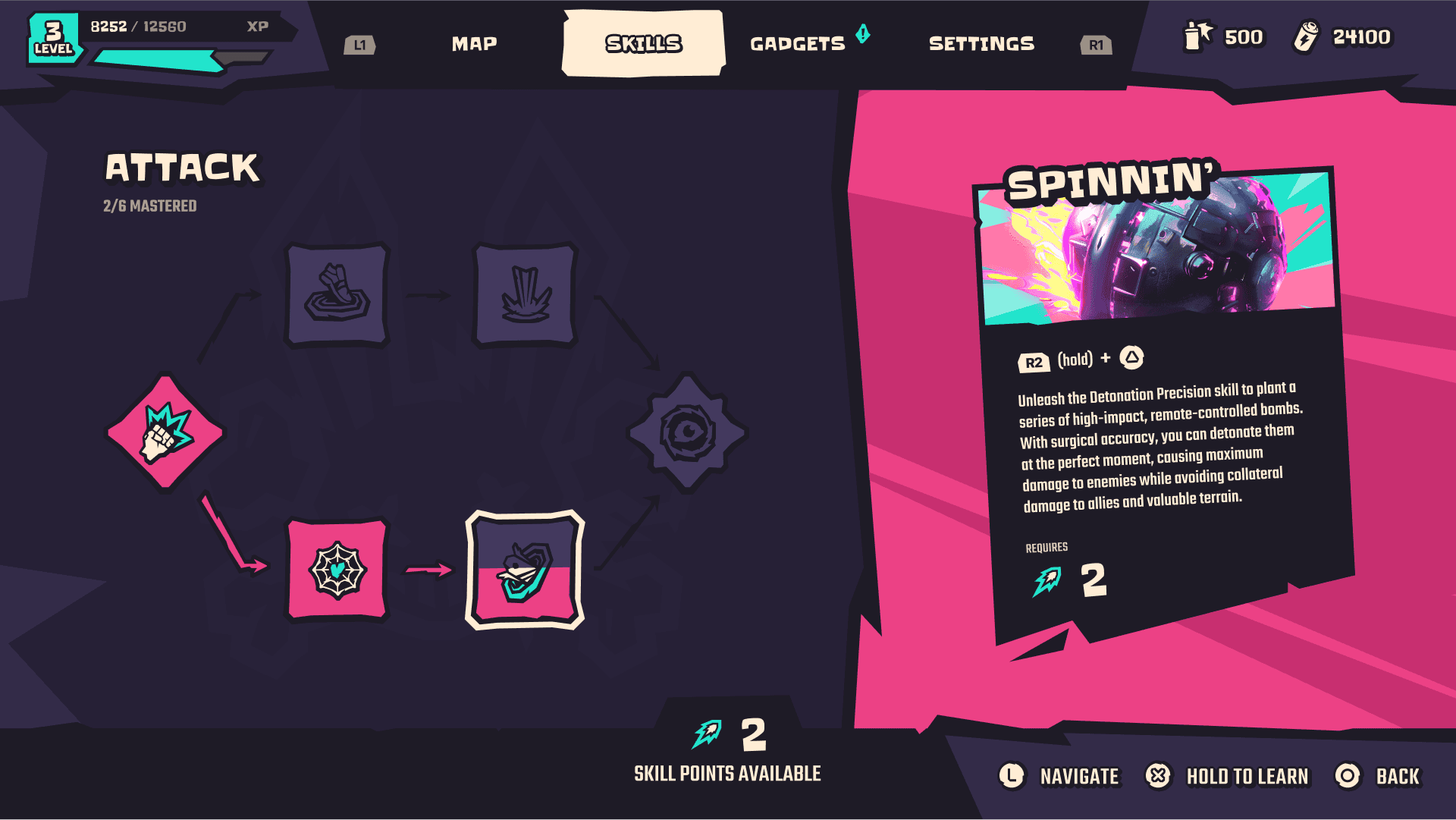
Skills + map
Click to view variants


Skills + map
Click to view variants


Skills + map
Click to view variants


Skills + map
Click to view variants


UI Principles
in two steps
UI Principles
in two steps
UI Principles
in two steps
UI Principles
in two steps
One of the challenges of this project was determining the game's level of "stylization" to avoid over- or under-doing the UI and its components. After some research, I created a chart and defined art pillars that perfectly capture the essence of the game.
One of the challenges of this project was determining the game's level of "stylization" to avoid over- or under-doing the UI and its components. After some research, I created a chart and defined art pillars that perfectly capture the essence of the game.
One of the challenges of this project was determining the game's level of "stylization" to avoid over- or under-doing the UI and its components. After some research, I created a chart and defined art pillars that perfectly capture the essence of the game.
step 1. stylization spectrum
To summarize: in its stylized UI, Chroma blends exaggerated and simplified designs, primarily favoring simplicity. This style is achieved by incorporating shapes with varying visual complexities, which adjust according to the context (more details in the next sections).
To summarize: in its stylized UI, Chroma blends exaggerated and simplified designs, primarily favoring simplicity. This style is achieved by incorporating shapes with varying visual complexities, which adjust according to the context (more details in the next sections).


Exaggerated
Exaggerated
Simplified
Simplified
step 2. art pillars


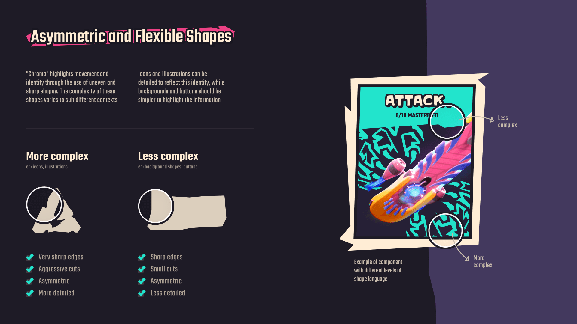
Asymmetric & flexible shapes
Utilizing uneven and sharp shapes is crucial to convey this concept movement and identity
Utilizing uneven and sharp shapes is crucial to convey this concept movement and identity
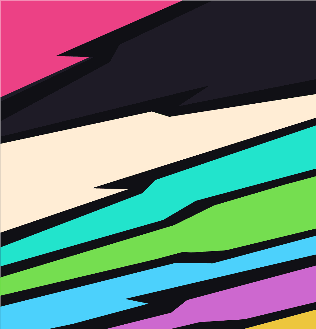


Energetic colors
Just like the main character, the UI brings a very fun, energetic and vibrant color palette
Just like the main character, the UI brings a very fun, energetic and vibrant color palette


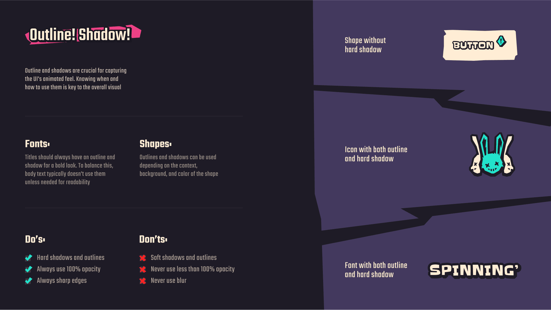
Strokes! Shadows!
Knowing when and how to use thick and sharp outlines and shadows is key to the overall visual
Knowing when and how to use thick and sharp outlines and shadows is key to the overall visual

more details
Click to view variants

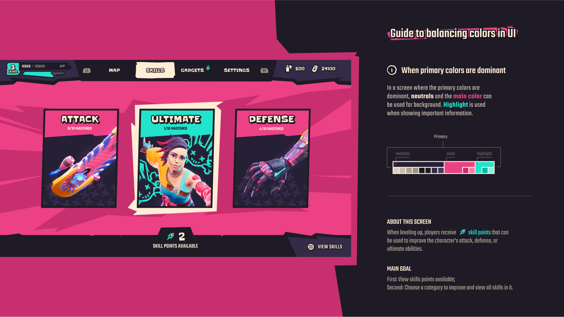
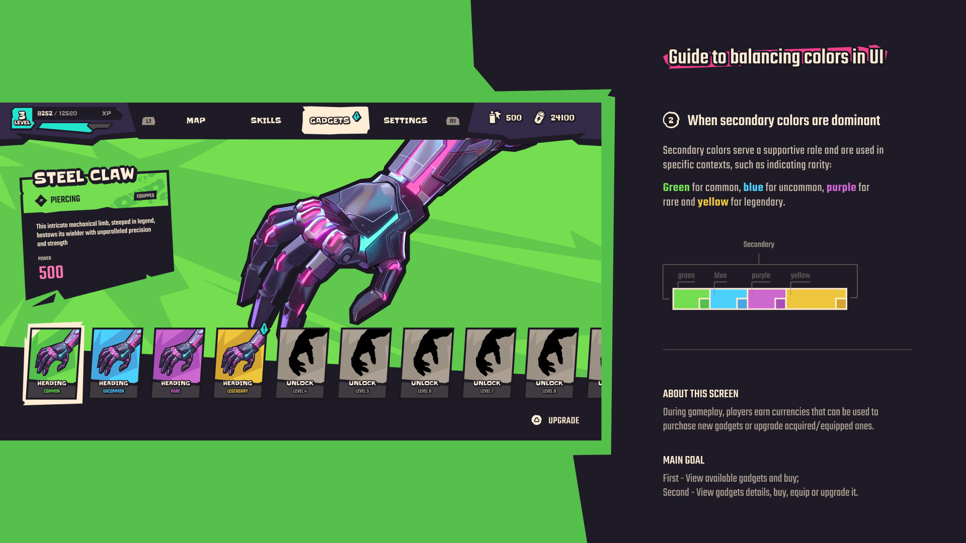
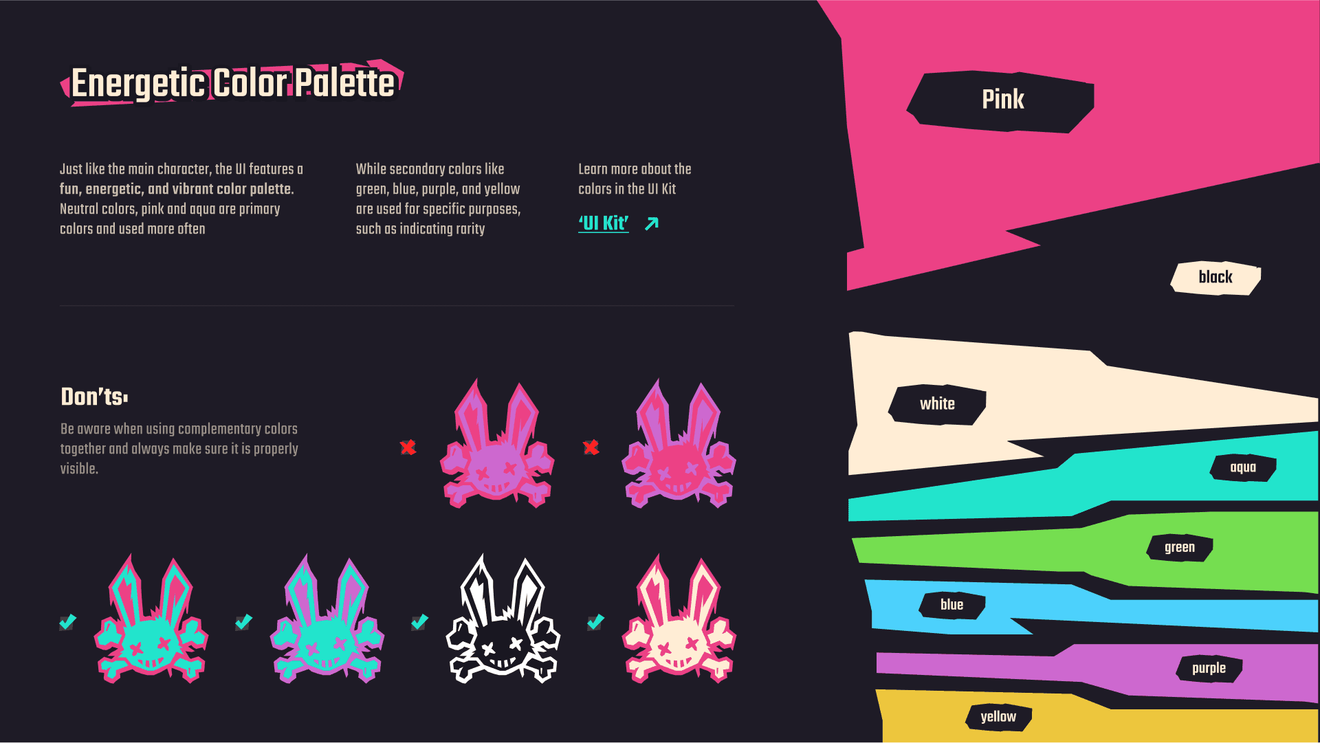

more details
Click to view variants


more details
Click to view variants


more details
Click to view variants


ui kit
ui kit
ui kit
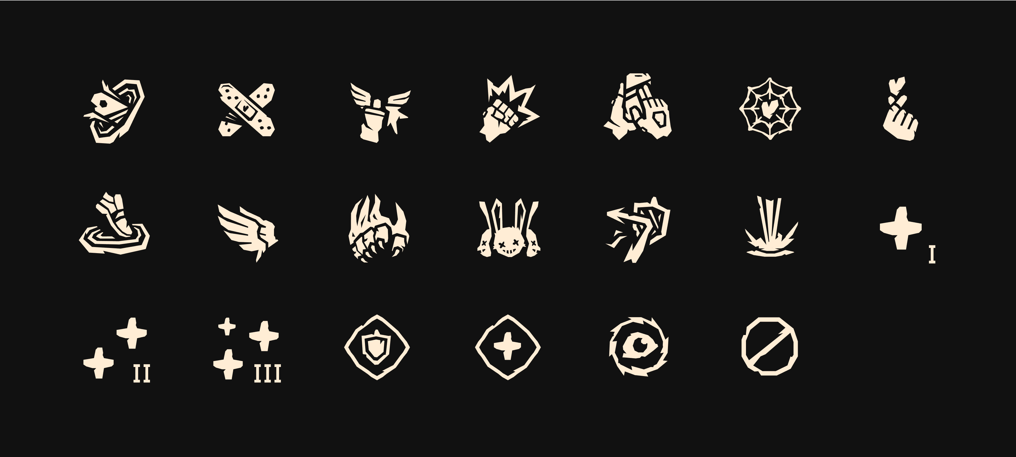
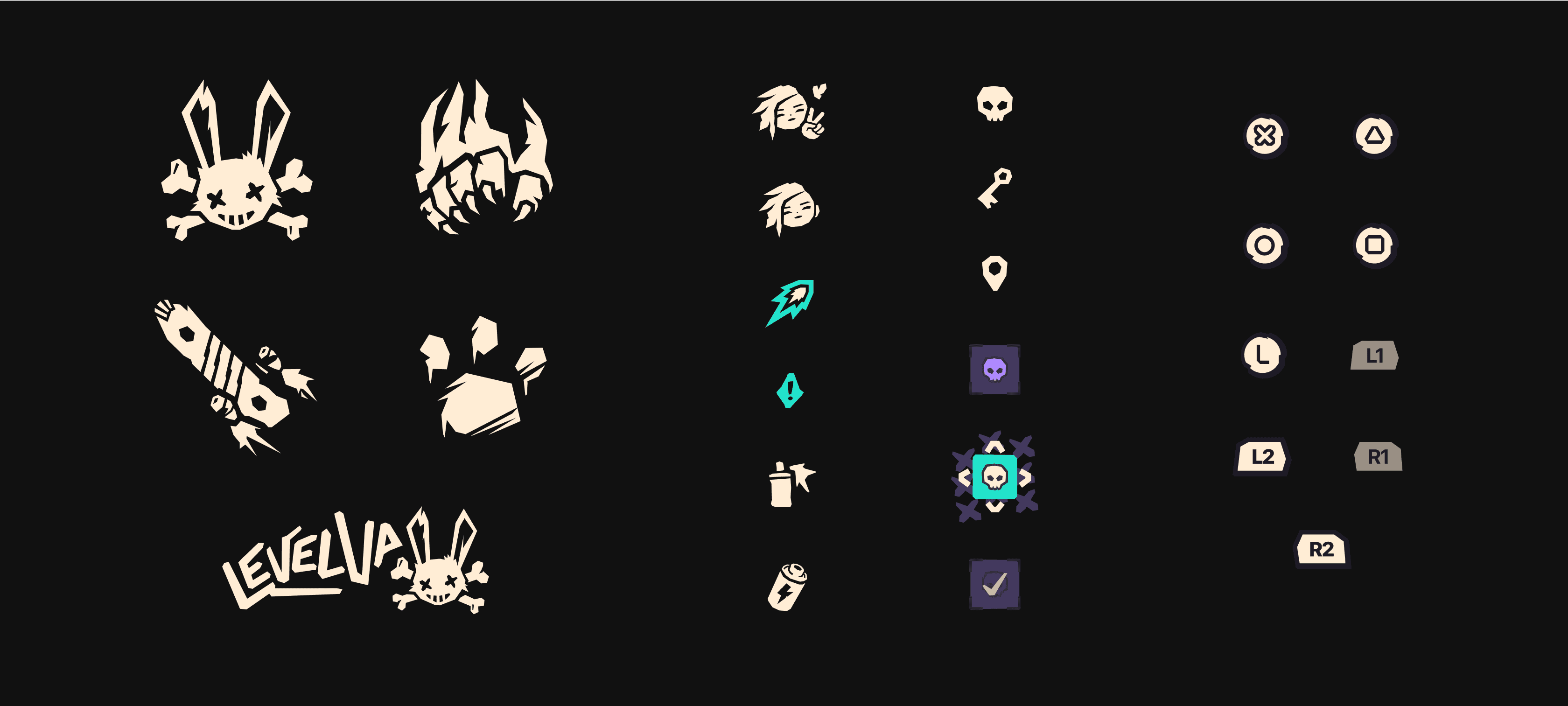
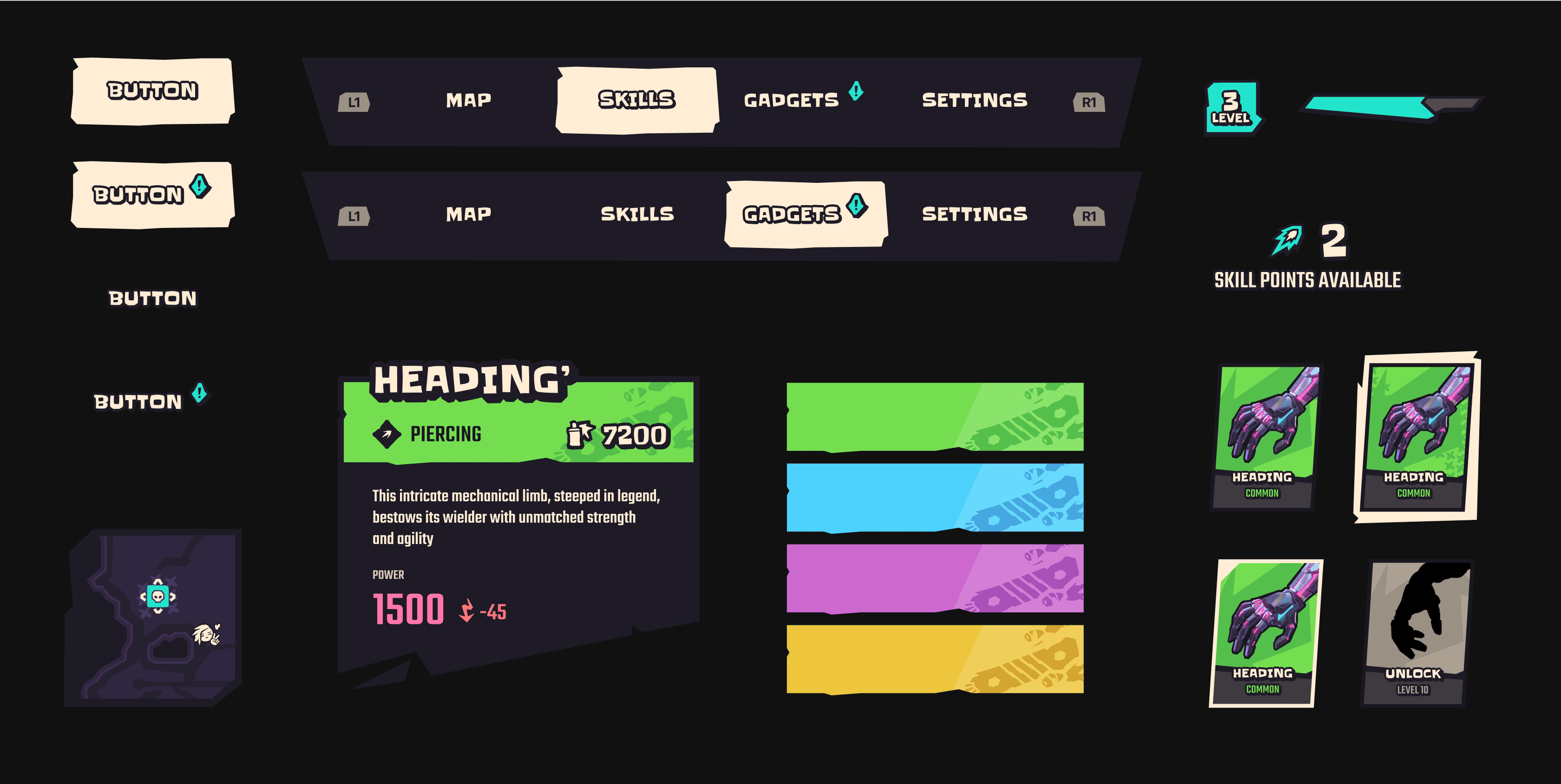
In Figma I created and categorized every component, element and variation. Because it’s too many things to show, I highligted some of my favorite assets below
In Figma I created and categorized every component, element and variation. Because it’s too many things to show, I highligted some of my favorite assets below
In Figma I created and categorized every component, element and variation. Because it’s too many things to show, I highligted some of my favorite assets below






research
research
research
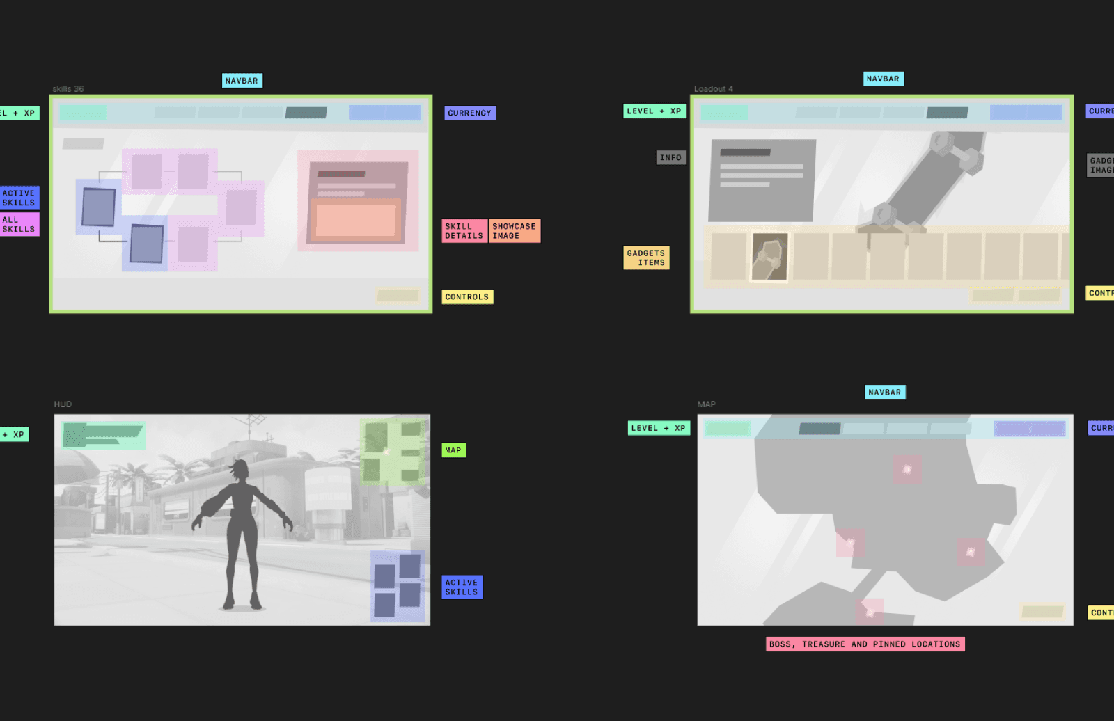
Last but not least, all of this actually started with a research. I had Hi-Fi Rush as a great reference since day 1, but went as deep as I could and started with a benchmark, created some wireframes, mapped all the information for each screen and tested some components.
Last but not least, all of this actually started with a research. I had Hi-Fi Rush as a great reference since day 1, but went as deep as I could and started with a benchmark, created some wireframes, mapped all the information for each screen and tested some components.
Last but not least, all of this actually started with a research. I had Hi-Fi Rush as a great reference since day 1, but went as deep as I could and started with a benchmark, created some wireframes, mapped all the information for each screen and tested some components.
Benchmarking Analysis
BenchmarkiNg Analysis
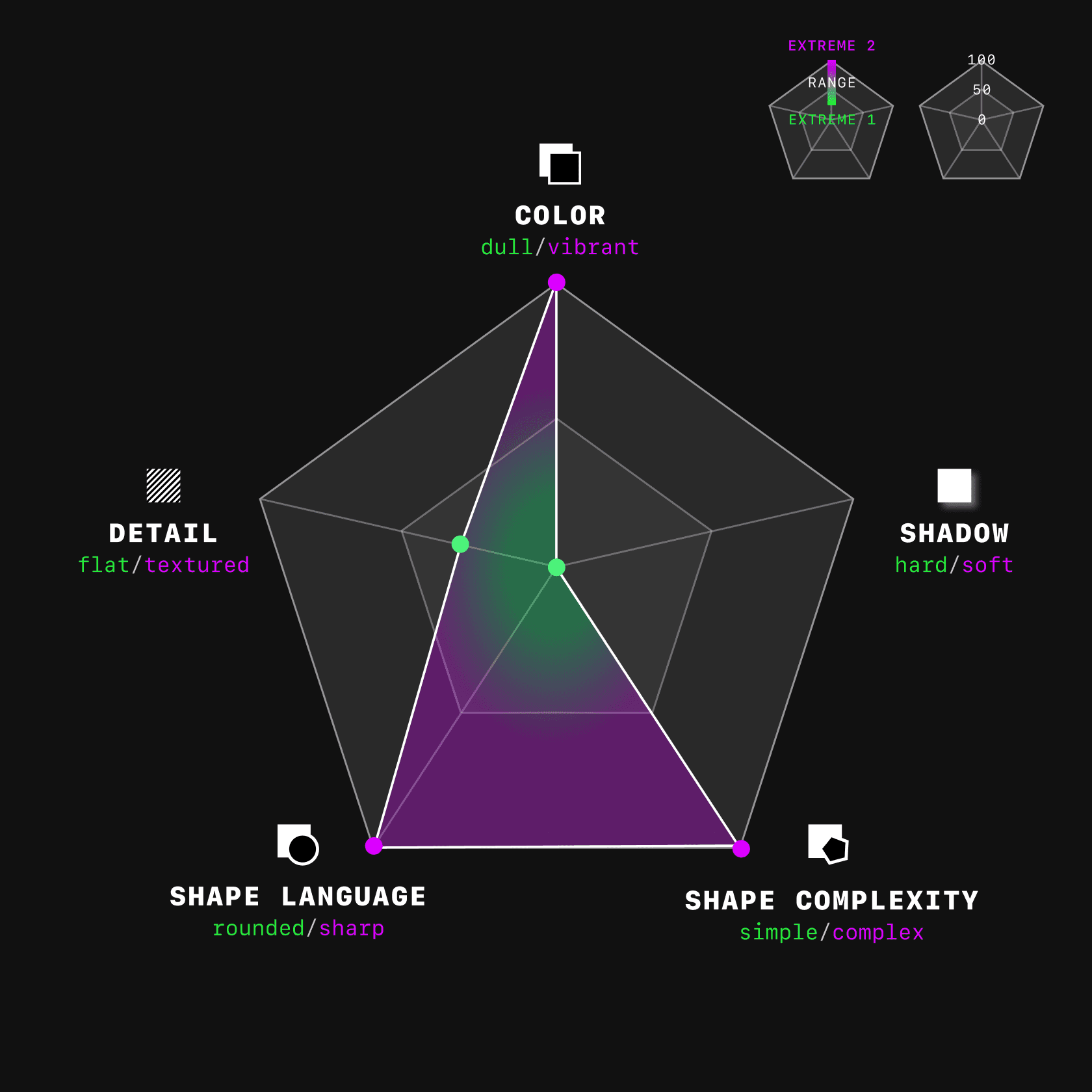
I use a style chart to analyze how other games handle key UI elements like color, shadow, shape complexity, shape language, and details. I also add comments and attach example images. For instance, in the game "Persona 5":
I use a style chart to analyze how other games handle key UI elements like color, shadow, shape complexity, shape language, and details. I also add comments and attach example images. For instance, in the game "Persona 5":
I use a style chart to analyze how other games handle key UI elements like color, shadow, shape complexity, shape language, and details. I also add comments and attach example images. For instance, in the game "Persona 5":
I use a style chart to analyze how other games handle key UI elements like color, shadow, shape complexity, shape language, and details. I also add comments and attach example images. For instance, in the game "Persona 5":
Colors
Colors
Colors
Colors
Very vibrant palette, high contrast, complementary colors.
Very vibrant palette, high contrast, complementary colors.
Very vibrant palette, high contrast, complementary colors.
Very vibrant palette, high contrast, complementary colors.
Shadows
Shadows
Shadows
Shadows
Some neubrutalism ― thick and dark outlines, sharp shadows.
Some neubrutalism ― thick and dark outlines, sharp shadows.
Some neubrutalism ― thick and dark outlines, sharp shadows.
Some neubrutalism ― thick and dark outlines, sharp shadows.
details
details
details
details
Some use of textures, but main focus is flat colors.
Some use of textures, but main focus is flat colors.
Some use of textures, but main focus is flat colors.
Some use of textures, but main focus is flat colors.
shapes
shapes
shapes
shapes
Very exaggerated ― asymmetric and super complex, sharp shapes and fonts. Movement feeling.
Very exaggerated ― asymmetric and super complex, sharp shapes and fonts. Movement feeling.
Very exaggerated ― asymmetric and super complex, sharp shapes and fonts. Movement feeling.
Very exaggerated ― asymmetric and super complex, sharp shapes and fonts. Movement feeling.




(Information Mapping - Identifying key information and its Location)
(Information Mapping - Identifying key
information and its Location)


(Low fidelity wireframes - Experimenting different structures)
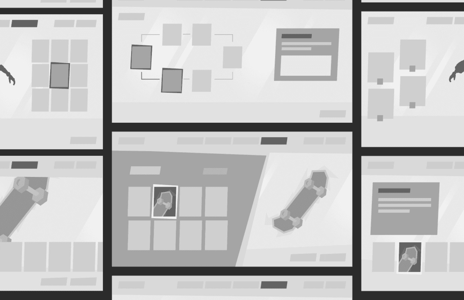
(Low fidelity wireframes - Experimenting
different structures)
(MENU - Before: wireframe / after: final UI
(MENU - Before: Wireframe / After: Final UI
Thank you for taking the
time to view my work
Thank you for taking the
time to view my work
I'm very happy with the results of this project. It was incredibly rewarding and fun to learn new things and practice my abilities. I hope you enjoyed exploring it as much as I enjoyed creating it!
I'm very happy with the results of this project. It was incredibly rewarding and fun to learn new things and practice my abilities. I hope you enjoyed exploring it as much as I enjoyed creating it!
